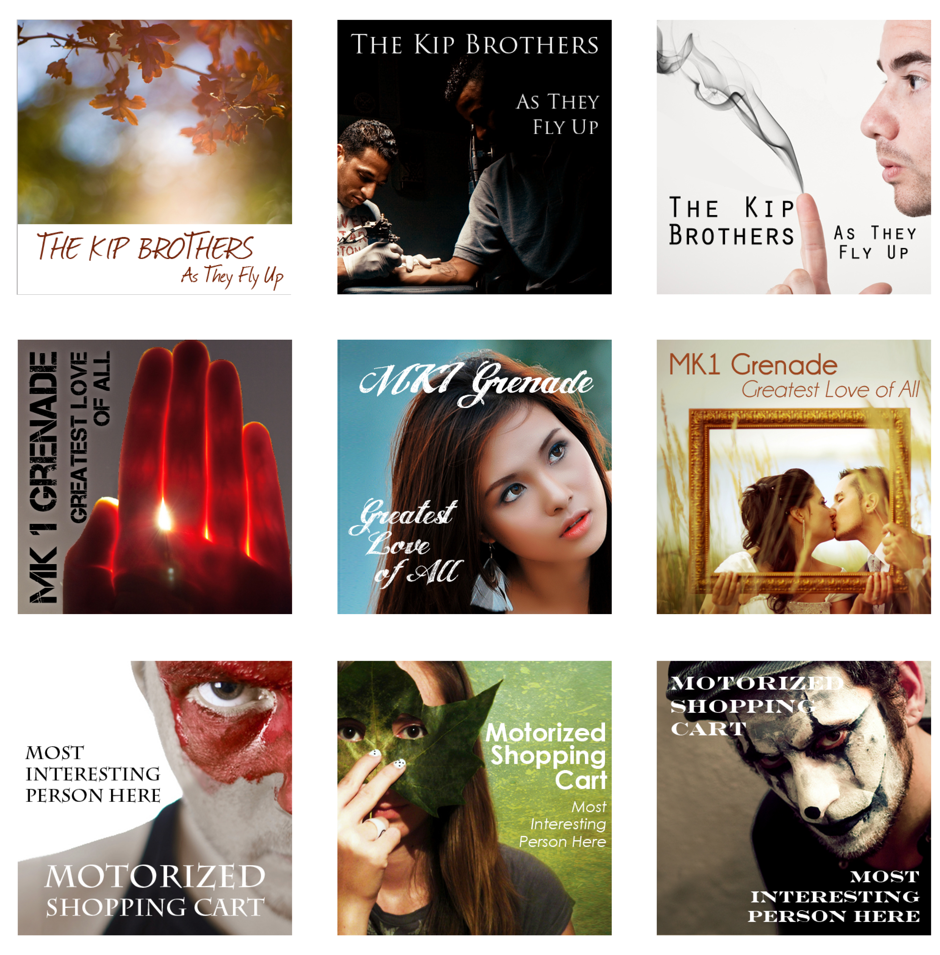

Third-year student Sara Federbush keeps her room in order. Articles of clothing are arranged by color, in accordance with the rainbow order she learned at a young age, in a closet lined with polkadotted boxes labeled by their contents. Each poster lining her walls is the same height. Photo credits sit at the bottom of these picture frames on oak tag constructions, noting which artist posted those images on Flickr.com; but from a distance, Federbush said visitors mainly see a pink and green color scheme that took weeks for her to create.
Each poster is a collection of several images – flowers, ladybugs, cookies and whatnot – that come together as one. This concept is one which Federbush said drives her personal creations developed in art classes at SUNY New Paltz and beyond.
“I love making collages and I guess that is because my personality is sort of scattered and in pieces,” she said. “It is nice to bring it all together in a neat way.”
Now that she has been accepted into the Bachelor of Fine Arts program for graphic design, Federbush said she looks forward to a future of simplifying concepts into one image so consumers can literally judge books by their covers.
Federbush, from East Meadow, Long Island, first took interest in art at the age of 10 when her parents purchased a VCR. She said she would record her favorite cartoon and anime programs, pause them and try to recreate the still images on the screen. However, the idea to pursue graphic design didn’t come until she reached high school.
During her junior year, Federbush said she excelled in a computer graphics course. Her teacher then asked her to design the cover of the 2007-08 student planner. She said turning out this product became an inspiring experience.
“I just felt a great sense of achievement after I did it,” Federbush said. “I saw other people carrying physical copies of my work, and it was almost like I had some kind of connection to everyone.”
Though her interests within the graphic design field continue to change, Federbush said she currently enjoys working on package design projects. She said this allows her and other designers to create a personality for a product by using images and type.
Type, or the font used for text elements of a design, is something Federbush said is very important to her work. The height, thickness and orientation of type should be able to clue consumers in to the target audience for a particular product, according to Federbush.
In this way, Federbush said type should be treated as imagery itself in graphic design.
“A picture is worth a thousand words, but a thousand words can be worth 2,000 words with the right type treatment or font personality,” she said.
But combining complimentary type and image elements into a design has become more challenging in the digital age, said Federbush.
As magazines, newspapers and other products become less relevant, Federbush said she has had to adapt her skills. Instead of creating the spine, back and front covers of a book, she must consider the Kindle image. CD cover art projects maxed out at three inches – a more iTunes-friendly size. And learning about coding for website design has become an ongoing process.
Federbush said the emphasis on digital design puts pressure on those in the field to be concise and clear with the images they present to ever-growing audiences.
“Reality is becoming a bunch of pixels digitized on the screen of your iPhone,” she said. “Mass production has become more prevalent, which is a little terrifying. But it challenges designers to grab attention and simplify a lot of information.”
As she pursues a career in the “art of the future,” Federbush said attention to detail in design has become more important.
Although she does not have time to pursue a second major, Federbush said she considers principles of psychology when working on a design. Examining what images the masses associate with certain ideas should be heavily considered, she said.
Additionally, Federbush feels that thinking about the appearance of all parts of a package or design is something she strives to do. Products like a box of banana juice where part of the carton is molded to mimic the shape of the fruit inspire her. These kinds of elements are things she tries to incorporate in her own work.
“I guess I do tend to over-examine things in art and in the people around me, but I see it as developing a bigger web of information,” she said.
Her portfolio includes a piece that interprets the phrase “beauty is in the eye of the beholder” visually. In the work, the word “eye” is replaced with several versions of the letter “i,” all in different fonts and colors. Federbush said another one of her favorite works incorporates lines like “you are not a calorie count” and other phrases related to body image. The sentences, ranging in font size and thickness, are stacked in a way that forms the curves of a woman’s body along the edge of a piece of paper. In both designs, no other images are used aside from the text.
Federbush said that as she works in the studio, on her thesis and finding a job. She hopes to create clean designs that balance all of these elements.
“I don’t want anything to look like a bunch of puzzle pieces that don’t necessarily fit together,” she said “You have to promote a concept in a clear way. And in the end, it’s as if there is a little piece of you widespread.”
